FLOWS & UI
Revitalising member account management
Cashrewards
Figma
3 weeks
User interviews, wireframing, user testing, UI design
Summary
CRops is an internal properity CMS that powers Cashrewards cashback operations, such as member account, transaction, merchant and card linking management. The platform is a vital tool that’s used daily by Cashrewards employees.
The experience and design of member account management has never been reviewed and validated, which has contributed to inefficient ways of working. This is due to years of de-prioritisation. My role was to understand what pain points the Member/Customer Service team experience when managing member accounts on CRops and uplift the overall experience.

Understanding the process and problem
To gain a better understanding of the platform and how employees use it, I simply spoke to them. I asked them to walk through how they use the platform in their day-to-day and discuss what's their biggest challenges.
6 one-on-one interviews
Member Search – Key insights
-
Search container takes up a lot of screen real estate
-
Redundant fields and filters. Users didn't understand what the Validated dropdown means and never search by Click ID.
-
Input email or member ID to search for members
-
When searching by mobile, it must be entered in a specific format (+61 and space)


Search Results table – Key insights
-
Status and Active columns have no difference. Active column can deactivate the account.
-
Key actions should be consolidated (View Statement, View Clicks and View Bank Detail).
-
Gender is not necessary in this view.
-
No way to filter or sort loaded results.
-
Not easy to scan – order of columns isn't ordered by what they view most.

Member Statement – Key insights
-
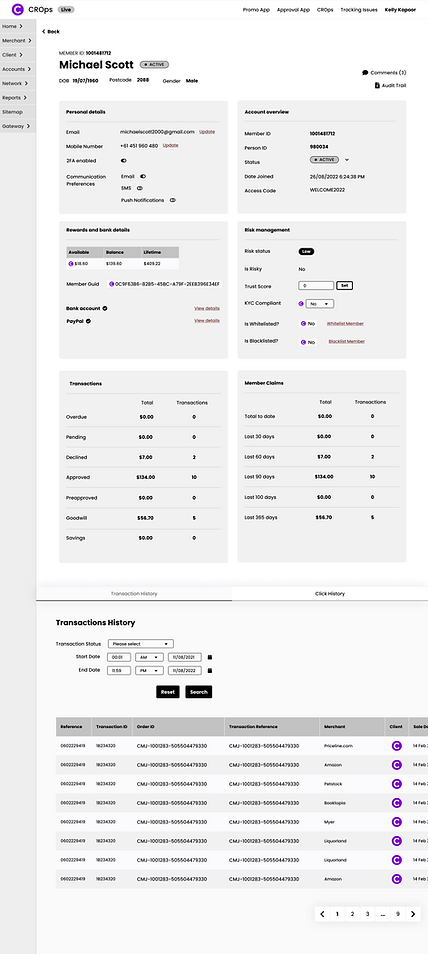
Cannot update mobile number or email address in this view.
-
No quick links to access bank details or click history. Bank details and click history is usually viewed alongside key member account information that's only viewable in the Member Statement.
-
No audit trail to see any past account modification activity.
-
Logos are distracting

Wireframing to find the right design
I developed a few wireframe design options and presented it to users, ensuring the focus remained on whether they can easily access key information and complete vital tasks, not visual elements such as colours.
Member Search and Search Results – Usability testing key insights
-
All users preferred a global search function with an advanced search option.
-
Users preferred revised order of the search results table and appreciated the consolidation.
-
There was questions around whether they could update mobile numbers and emails in the results table.

.png)
✨ New table

📜 Old table

Member Statement – Usability testing key insights
-
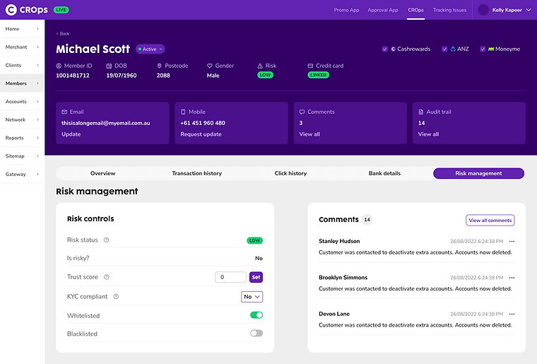
All users preferred Option B. The ability to quickly switch between tabs would be more efficient than having to scroll up and down to cross-check information. All Immediate actions to be done are at the top.
-
Users need to see all previous linked bank accounts which could be a long list. Therefore, bank details would need it's own tab.
-
All users preferred the comments section to be accessed via the sidebar rather than in the risk management tab as it's clearer that comments include general comments, not just limited to risk.
Option A

Option B


Final design
Once the key functionalities, layout and flow was validated, I worked on the high-fidelity design. Compared to the old design, the design utilised the existing Cashrewards brand and leverages brand colours to provide visual hierarchy and attention to crucial elements and actions.


Outcome
In conclusion, the redesigned account management platform has not only addressed previous shortcomings but has resulted in enhanced efficiency, convenience and user satisfaction.
"The new design is more intuitive and easier to navigate. I no longer have to spend hours training new team members or use hacky work arounds to complete simple actions. I can action everything all in one member account view."
Cashrewards Member Services Team Member